8 min read
You can do a useful partial accessibility audit of your own website in about an afternoon (depending on the size of your site). Not a complete one, mind, but a real approach nevertheless. Accessibility auditing is not a dark art.
Set aside roughly three hours, run five timed passes, and you will find things that are currently stopping people from using your site. It is real-world checks, done in person, in a sensible order, written down as you go, with consideration for all disability types and use cases. What follows is a recommended testing order to help start identifying those accessibility hurdles.
It’s worth noting that your afternoon of testing won’t identify issues that are encountered by users who rely on assistive technologies. For this, we always need real-world testers from a wide range of disabilities.
Where accessibility auditing starts
Pick your primary pages or templates before you start. An example of a cross-section taken from a recent Shopify ecommerce store:
- Homepage
- Collection page
- Product page
- Cart page
- Blog index page
- Blog single page
Testing every page is a drawn-out process and it will not fit into an afternoon. For the professional version, what an accessibility audit actually involves sets it out.
So you’ve got your primary pages selected; let’s kick things off.
Pass one: the automated sweep (20 minutes)
Three free tools, run on each page you picked.
WAVE puts a visual overlay on the page itself, the easiest way in if you have never done this. axe DevTools runs inside browser developer tools and is stricter about false positives. Lighthouse is already in Chrome and gives a score, useful for tracking movement and almost useless as a measure of whether your site works. Run all three. Their rulesets overlap but do not match, and the disagreements teach you the criteria properly.
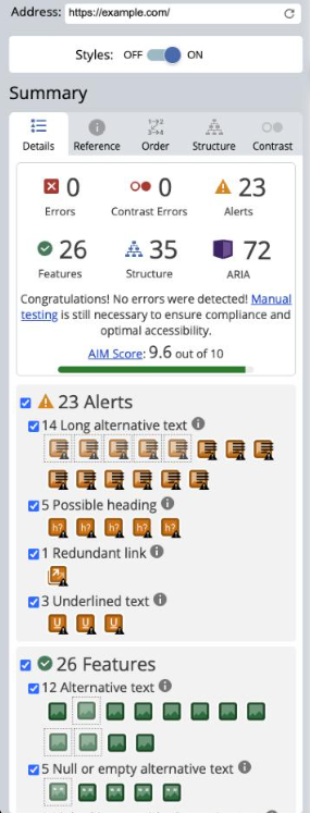

For scale, the WebAIM Million tested the top one million home pages in February 2026 and found detectable WCAG failures on 95.9% of them, averaging 56.1 errors per page. Detectable is the operative word. W3C puts it plainly in its guidance on selecting evaluation tools: tools cannot determine accessibility, they can only assist you in doing so.
Contrast deserves its own check, because it can be context-specific. Put your real brand colours and text sizes through a colour contrast checker. It is the most common detected failure on the web and the easiest thing here to fix.
To be clear: we do not run a scanner at Accessima, and I would be wary of anyone selling you one as a substitute for the four manual passes below.
Pass two: the keyboard (30 minutes)
Put the mouse away. Genuinely away. Now use your keyboard to navigate. Use the tab key to tab through each page from the top and watch five things.
Can you always see where you are? A focus indicator has to be visible on every interactive element, and plenty of themes quietly remove it in CSS.
Does focus order match visual order? If the highlight jumps somewhere unexpected, source order and layout have drifted apart.
Can you get out of everything? Open a modal, a menu, a date picker, a cookie banner. If Tab cycles forever inside it and Escape does nothing, that is a keyboard trap, and for some people it ends the visit.
Is there a skip link? Tab once from the very top. If nothing appears, every keyboard user tabs through your whole navigation on every page.
Does anything cover the focused element? Sticky headers and chat widgets are the usual culprits. This became its own criterion in WCAG 2.2, 2.4.11 Focus Not Obscured, wording in the WCAG 2.2 specification.
If you only have thirty minutes for the whole exercise, spend them here.
Pass three: the reading pass (45 minutes)
No tool can do this pass for you, because every check is a judgement call.
Headings. View the heading outline (WAVE and axe both show one) and read it as a list. It should read like a contents page. No skipped levels, no headings used because the text needed to be bigger.
Alt text. For every image on the page, ask what the page loses if it vanishes. Decorative images should take an empty alt attribute so they aren’t announced. Meaningful images need a sentence doing the same job the image does, which is harder than most people expect. Writing alt text properly covers the cases that catch people out.
Link text. Copy every link into a list, stripped of its sentence. If you cannot tell where a link goes from its own words, neither can someone tabbing between them.
Form labels. Every field needs a visible label that stays visible once filled. Placeholder text is not a label. Then trigger every error message you can and check it says what went wrong and how to fix it.
Pass four: zoom and reflow (20 minutes)
Two checks, and layouts break here more often than people expect.
Set the browser to 200% zoom and read the page. Text should still be readable, nothing clipped or overlapping.
Then set the window to 1280 pixels wide and zoom to 400%, roughly the 320-pixel viewport WCAG calls reflow. Everything should stack into one column, nothing should need horizontal scrolling, and no sticky element should eat half the screen. Tables and pricing grids are where this falls over.
Pass five: one screen reader task (45 minutes)
Install NVDA if you are on Windows. It is free. On a Mac, VoiceOver is already there.
Pick one task. Buy something, book something, send an enquiry. Not the whole site, one task, start to finish. Ten minutes learning the basic keys, then run it. It will be uncomfortable, and that is most of the value. You will hear your own page announce things you did not know it said.
Now, the caveat that matters. An hour with NVDA does not make you a screen reader user and does not tell you what one would experience. They move faster than you, use shortcuts you have never heard of, and have settings tuned over years. What the hour gives you is the shape of the problem. What a website feels like to someone who is blind is worth reading alongside it.
Writing it up
A finding you did not record is a finding you will forget by next week. For each one, note the page URL, what you did, what happened, what you expected instead, which WCAG criterion it relates to, and how badly it affects the task. Screenshot everything. Our accessibility audit checklist works as a structure to record against.
Then sort by whether something blocks a task, not by how many pages it appears on. One broken checkout button outranks two hundred decorative images missing alt attributes.
Why I tell people to do this even though I sell audits
This article gives away a chunk of what we charge for, and I have been asked why more than once.
Three reasons. Most people who work through an afternoon of this were never going to buy an audit, and their sites still get better, which is the point of the job. It shows the gap honestly, because you find the machine-detectable failures yourself and then walk straight into the judgement calls. And people who buy afterwards are better clients, because they know what they are paying for.
There is a harder opinion underneath. I think this field has an interest in looking more mysterious than it is, and overlay vendors benefit most, because “too complicated to check yourself” is what their pitch rests on. It is not too complicated. Most of what I find on day one is findable by any careful person with a keyboard and three hours. What takes practice is the layer below: knowing which of forty findings actually matters, reading ARIA that is technically valid and practically useless, judging whether a custom component behaves the way its role promises. That is the part worth paying for, and pretending the first layer is mysterious too just makes the field less trusted. The longer version is in manual versus automated testing.
What an afternoon still will not cover
Four things, and none of them are a pitch. Cognitive load: whether people can understand and finish your process rather than whether the markup is correct. Colour perception beyond contrast ratios, including how charts and status indicators read to someone with a colour vision deficiency. Real assistive technology setups, meaning JAWS with a decade of personal settings rather than NVDA at defaults. And testing by users with lived disabilities, the only method that tells you what actually happens rather than what should.
An afternoon is not nothing, though. Do it, fix what you find, and you have removed real barriers for real people, which is the only score that counts.
If you want a second pair of eyes on your findings, or you reach the point where the answers stop being obvious, get in touch, and we can talk about what a full manual audit adds.