
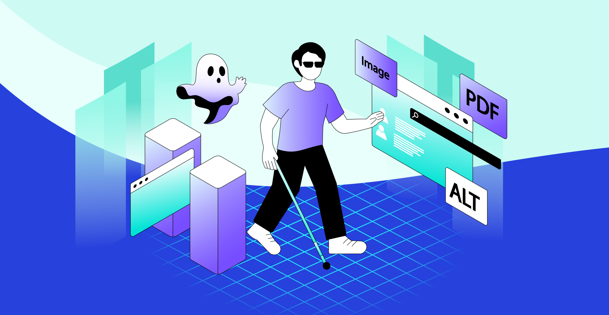
Clicking in the Dark. Why Your Website Feels Like a Haunted House to Users Who Are Blind
Have you ever tried walking into a room where someone's moved the furniture without telling you? You think you know the path, but suddenly your shin finds the coffee table. That's what using an inaccessible website feels like for a blind person. Except instead of bruises, I get endless error messages, missing buttons, and the delightful chorus of my screen reader sighing at me.
I've been navigating the web without sight for years, and let me tell you, the internet is either the greatest equaliser humanity has invented, or it's a maze with greased walls. The difference comes down to accessibility. And unfortunately, far too many websites get it wrong.
So let's pull back the curtain. Here are the most common accessibility mistakes I encounter online, and why they're so frustrating for end users like me.
Alt Text, The Great Vanishing Act
Imagine reading a cookbook where every other page says, 'Picture Here.' That's what it's like when images don't have alt text. If you sell products online and your 'Add to Cart' button is actually just a picture of a shopping basket with no description, my screen reader will politely say 'Image.' That's it. Which one adds it to my cart? Which one shows details? Which one is just your logo slapped everywhere like a toddler with a sticker book?
The result? I can't buy what you're selling. Which means you lose money, and I lose patience.
Keyboard Navigation, The Forgotten Player Two
Some people drive cars. I tab through websites. If your site doesn't let me move around using just the keyboard, it's basically telling me 'cool story, but you don't get to play.'
Dropdown menus that vanish when I tab to them, buttons I can't reach, pop-ups that trap me in an endless cycle like a cursed video game, this is my daily battlefield. Mouse-only interactions slam the door on blind users. Full stop.
Headings, Choose Your Own Adventure, But Blindfolded
Headings are the road signs of the web. They let me skim, jump, and find what I need. But when you skip levels, stuff everything in H1, or use bold text instead of actual headings, it's like tearing down all the street signs and painting 'ROAD' on random walls.
Instead of finding the 'Contact Us' section in two keystrokes, I'm stuck wandering a forest of unlabeled text.
Forms, The Wild West of Confusion
'Edit box. Blank.' That's what my screen reader tells me when I encounter your form field without a label. What am I supposed to type here? My name? My credit card? My deepest childhood fear?
And let's not forget the CAPTCHA that demands I select all images with traffic lights.' You may as well ask me to lick the screen and guess.
Unlabeled forms and inaccessible CAPTCHAs stop me from signing up, subscribing, or purchasing. They're digital locked doors.
Auto-Playing Media, The Screaming Baby of the Internet
Picture this, I'm filling out a form, carefully navigating line by line, when suddenly, your site blasts an auto-playing video. My screen reader and your video fight to the death for my attention, and I lose.
The result? I literally cannot hear my screen reader. It's like trying to read while someone shouts in your ear.
Links, 'Click Here' and Other Useless Relics
I'm tabbing through your page, and my screen reader cheerfully announces 'Link. Click here.' Click here for what? Salvation? A recipe? A bot farm?
Context-free links mean I have to read the entire paragraph just to understand what 'click here' does. That's not accessibility, it's scavenger hunting.
Visual-Only Instructions, The Map with No Compass
'Press the green button to continue.' That's adorable. Which one of your five buttons is green? When instructions solely rely on colour or visual cues, blind users are stranded.
Pop-Ups and Modals, The Trap Doors of the Web
Few things strike terror into my heart like the words 'Modal Dialogue.' If your pop-up steals focus and doesn't let me leave, I'm stuck in purgatory. Refresh, start over, hope my data wasn't lost.
Trapping users breaks the web experience. Sometimes I can't even get back to the content.
PDFs, The Internet's Equivalent of Cement Shoes
Have you ever tried opening a PDF with no tags, no structure, and 300 pages of 'graphic, graphic, graphic'? It's like being given a phone book written in Morse code. Untagged PDFs are unreadable. Period.
Overdesigned Interfaces, When Pretty Becomes Hostile
Some designers treat websites like art galleries. Minimalist white-on-white text. Fancy animations that vanish before a screen reader can announce them. Interactive charts that only exist as graphics.
A beautiful design that kills function is like a Ferrari with no steering wheel. Great to look at, but useless.
Why This Matters Beyond Me
Here's the thing. Accessibility isn't charity. It's not about giving blind people a pity pass into your digital clubhouse. It's about universal design. The features that help me clear headings, alt text, and descriptive links also help search engines, mobile users, people with dyslexia, and anyone multitasking with one eye on their toddler.
Accessibility makes the web better for everyone. And legally? Many countries have accessibility laws now. Skip it, and you're not just alienating users, you're inviting lawsuits.
The Bottom Line
When websites ignore accessibility, they're not just frustrating, they're exclusionary.
Every unlabeled button says, 'This space wasn't built for you.' Every autoplay video screams, 'Your needs don't matter.' Because the web was supposed to be the great equaliser. And right now, too many sites are haunted houses full of invisible walls, trap doors, and ghosts of good intentions.
So, to every designer, developer, and content creator reading this, stop building haunted houses. Build homes. Build roads. Build spaces where all of u,s blind, sighted, somewhere in between, can actually get where we're going without bruising our metaphorical shins.
And if you ever want to know how accessible your site really is? Don't just check a box on a compliance form. Fire up a screen reader. Tab through your content. Walk in my shoes for ten minutes.
I promise, you'll never forget where the coffee table is again.