How to Write Alt Text. Properly.

If you've ever uploaded an image and skipped the alt text box because you thought it didn't matter, or didn't know what to write, this is for you. We're going to look at the how, who, what, why, where, and when of alt text to leave you with no doubt in your mind about what you're going to do next time you see an 'alt text' box.
How
How does it make a difference to you, your business, and others? Well, Alt text is a small detail that makes a big difference. It helps users who are blind or have low-vision understand your content, improves SEO, and shows that your business actually cares about accessibility, not just compliance.
Who
Who is it for? In its simplest form, alternative text describes an image to people who can't see it. That could be someone using a screen reader, other assistive technology, or just someone on slow internet waiting for the page to load.
What
Alt text is a short written description hidden in your site's code. It's not a caption. It's not a list of keywords. It's what a screen reader reads aloud to explain what's on the page. Think of it like this. If someone couldn't see the image, what would you say to help them understand it?
Why
Why would you want to write alt text? Approximately 1 in 6 people have a disability. You write alt text because some people never see your images.
For screen reader users, alt text is the only way an image is explained. Without it, important information is missing or replaced with a useless file name. That can make a page confusing or incomplete.
Alt text also helps when images do not load. Slow connections, blocked images, or technical issues still happen. Alt text makes sure the meaning is not lost when the visual disappears.
There is also a legal side to it. Many accessibility laws and standards expect meaningful text alternatives for images. Missing or poor alt text is one of the easiest ways to fail an accessibility review.
A bonus, is the quality side. Writing good alt text forces you to think about why an image is there in the first place. If you cannot describe its purpose clearly, the image may not be doing much work.
At its core, alt text is about clarity. It makes sure everyone gets the same information, even when they experience the page differently.
Where
Alt text lives with the image itself, not in the surrounding copy. Where you add it depends on how the site is built.
If you are using a CMS like WordPress, Shopify, or Squarespace, there is usually a dedicated alt text field when you upload an image to the media library. This text is then attached to the image wherever it appears on the site.
If you are editing the site directly in code, alt text is added inside the image tag using the alt attribute. For example, an image without alt text or with placeholder text is effectively invisible to screen reader users.
The key point is that alt text should always be added at the image level. If your image has purpose and is more than just decorative, the alt text needs to be there too.
When
As soon as possible is the basic answer. Accessibility should be a ground-up effort, and you should avoid retrofitted solutions when possible. Write your alt text while you're uploading the image, not later. It's easier when the context is fresh in your mind.
If you work in a team, make it part of everyone's job. Designers, content writers, and developers all have a role in getting it right.
7 Golden Rules of Writing Alt Text
1. Describe the purpose, not just the picture
Focus on what the image adds to the page. If it's purely decorative, leave it empty, or if you're coding, mark it with alt="" so screen readers skip it.
2. Keep it concise
Most screen readers stop reading after about 125 characters. That's roughly one sentence. Keep it short and to the point.
3. Skip phrases like "Image of" or "Photo of"
Screen readers already announce it's an image, so repeating it is unnecessary.
4. Match the context
The same image can communicate different things depending on where it is used. Alt text should explain what the image means in that specific situation, not give a general description.
For example, imagine a photo of a person using a laptop.
On a remote work article, the alt text might be: "Person working on a laptop from a home office."
On a cybersecurity blog article, it might be: "Person logging into a laptop using two-factor authentication."
The image is identical, but the message is different. The alt text should reflect the point the page is making.
5. Function over form
When an image is being used as a button or a link, the alt text should explain the action, not the appearance. A magnifying glass is a good example. Calling it "magnifying glass icon" does not help anyone. Writing "Search" does, because it tells the user exactly what will happen when they select it.
6. Handle complex images differently
Charts, graphs, or infographics often need longer explanations and can be complex. Keep the alt text brief and link or refer to a fuller description nearby.
Example:
"Bar chart showing 2024 sales by region. Full data in the table below."
7. Don't repeat what's already there
If the same message is already written next to the image, there is no need to repeat it in the alt text. Screen reader users will hear that text anyway. The only thing that matters is that the meaning stays clear and consistent.
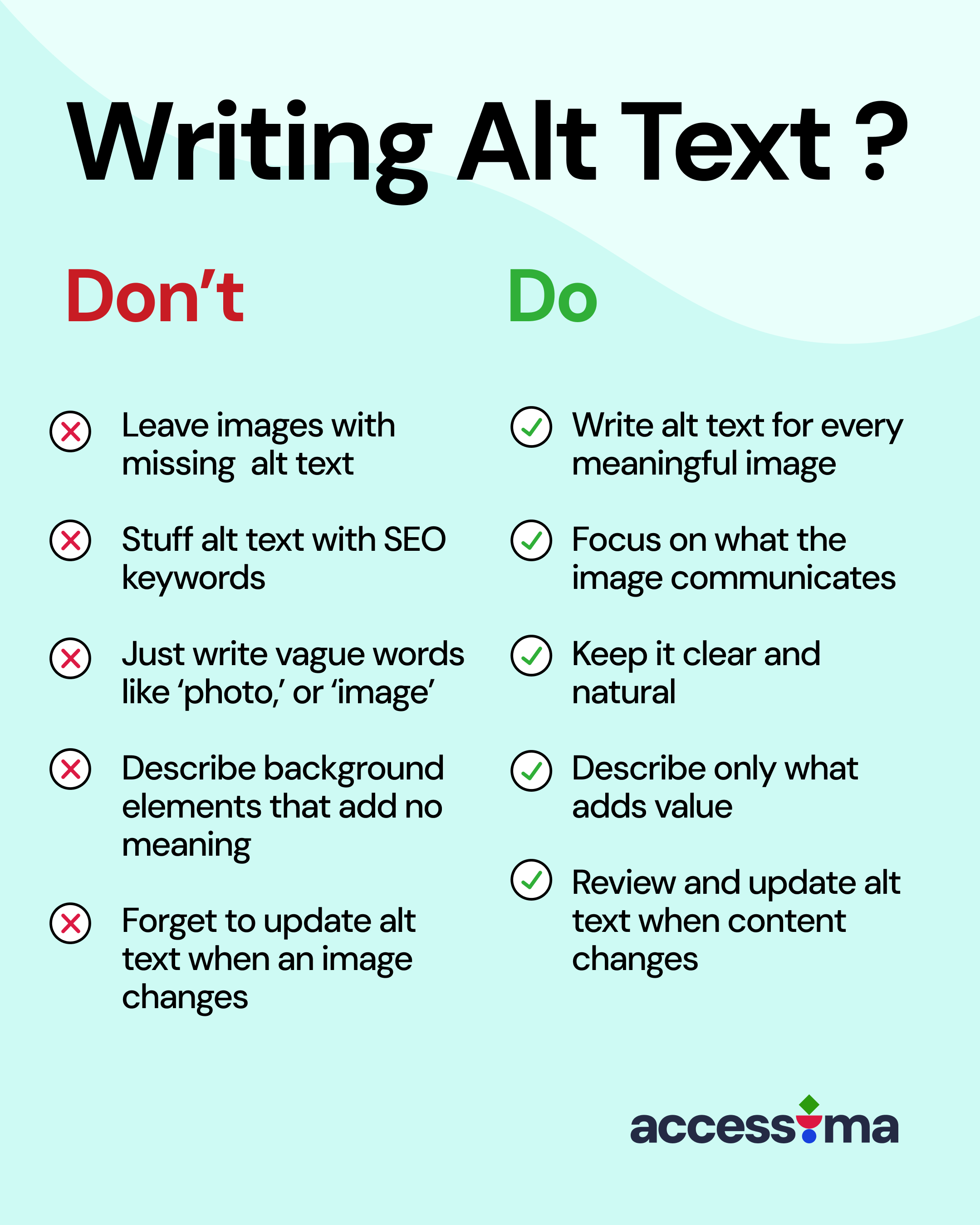
5 Common Alt Text Mistakes
- Leaving images without any alt text
- Stuffing alt text with SEO keywords
- Writing vague phrases like "photo," "graphic," or "image"
- Describing background elements that add no meaning
- Forgetting to update alt text when an image changes
Examples: Bad vs Good Alt Text
Example 1 - Standard Image

❌ Bad: "Person with cane"
✅ Good: "A person who is blind, using a screen reader on a laptop, with a cane by their side"
Example 2 - Icon/Image Button

❌ Bad: "Shopping cart icon"
✅ Good: "Buy now"
Example 3 - Graphs and Statistics
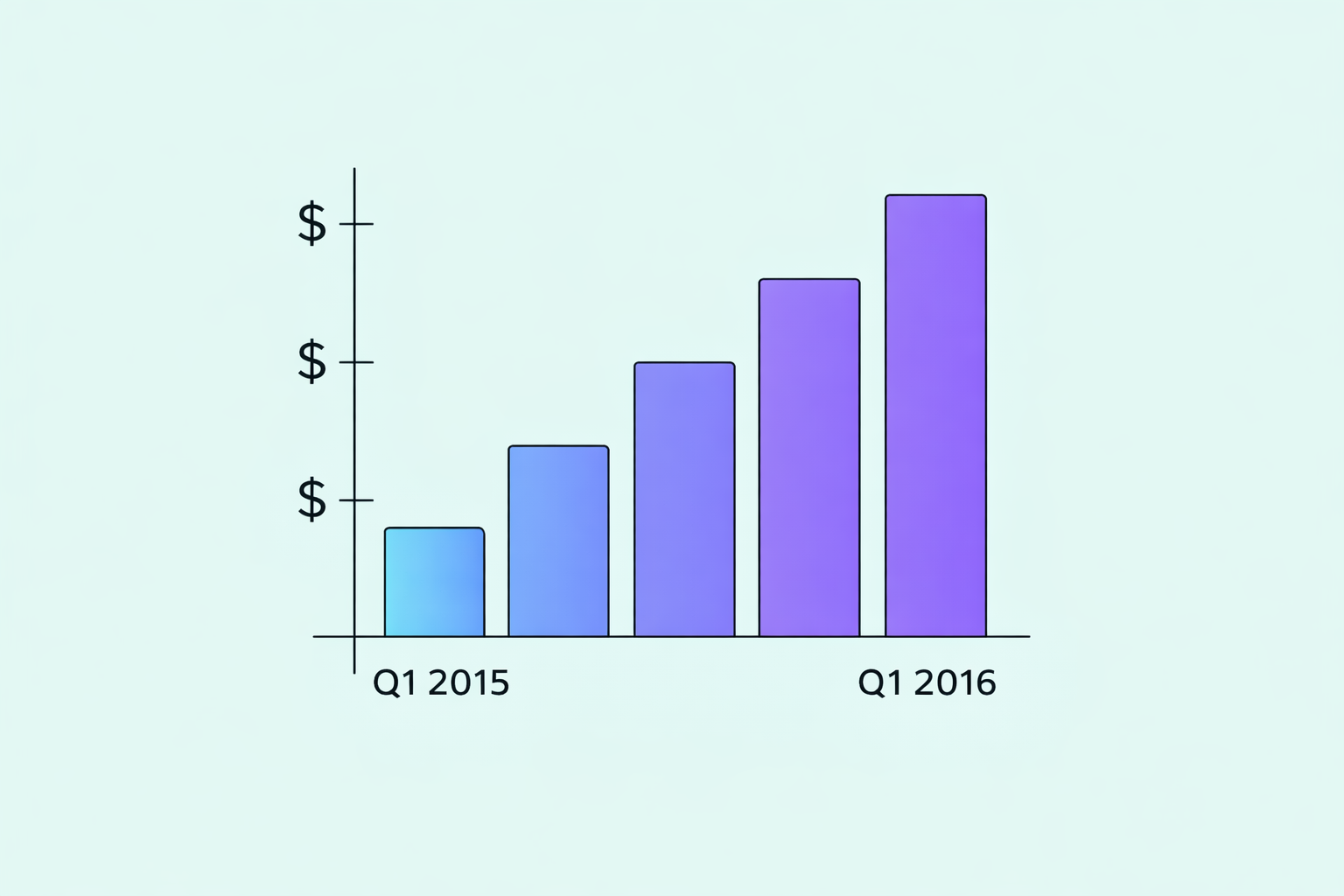
❌ Bad: "Graph"
✅ Good: "Quarterly bar chart showing net revenue rising steadily from Q1 2015 to Q1 2016."
Alt Text and Accessibility Laws
Accessibility is a legal requirement in many places. Most laws work in accordance with WCAG 2.1 AA. Under Success Criterion 1.1.1. If an image conveys information and has no alt text, it fails at Level A, which means it automatically fails Level AA as well.
UK: Equality Act 2010 and the Public Sector Bodies Accessibility Regulations
EU: Web Accessibility Directive and the upcoming European Accessibility Act
US: Americans with Disabilities Act (ADA) and Section 508
Following these standards keeps you compliant and, more importantly, shows that your business values inclusion.
Manual Review Matters
Automated tools are helpful, but they only check if alt text exists, not if it's any good. To know whether it's actually useful, you need human review.
At Accessima, we focus on manual-first accessibility audits that include real user feedback. Accessibility isn't just about meeting rules, it's about making sure people can actually use your site.
Final Thought
Alt text might seem like a tiny detail, but it's one of the simplest ways to make your website more welcoming. It tells visitors that you thought about them.
Next time you upload an image, pause for ten seconds and ask yourself: what would someone need to know if they couldn't see this?
That's your alt text.